Individual ETF Reports
Our ETF reports provide complex and comprehensive buffered ETF data in an easily readable and understandable format.
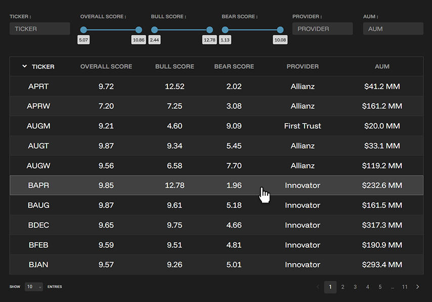
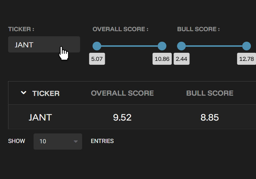
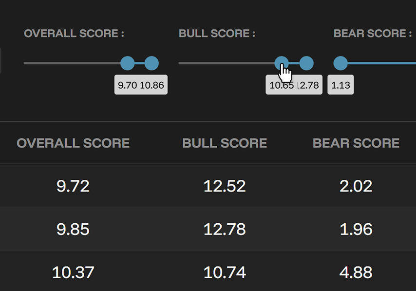
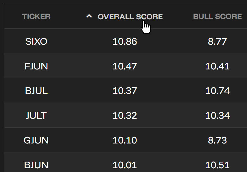
BufferLabs weekly reports cover most buffered ETFs in our universe with standardized components for easy assessment and comparison. We are continuously expanding our coverage to provide comprehensive research.
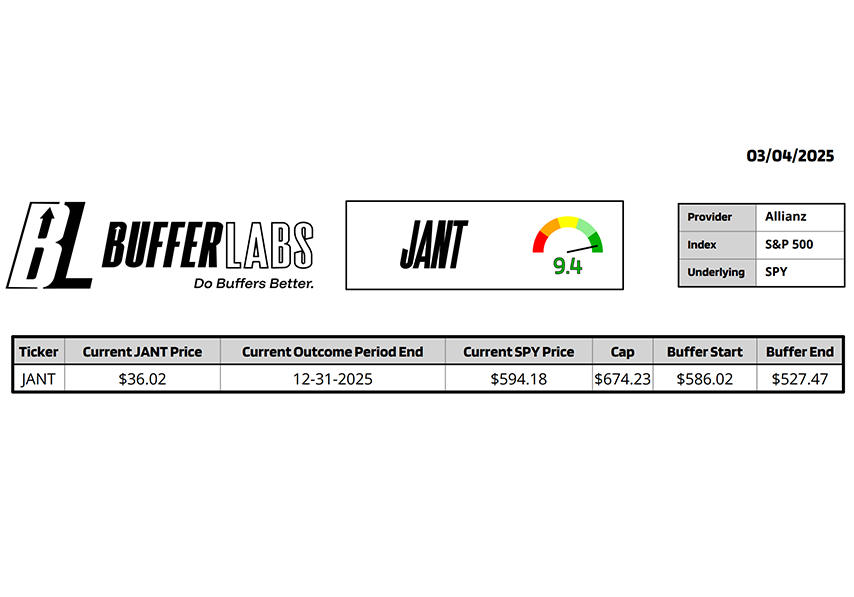
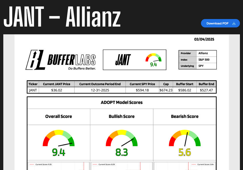
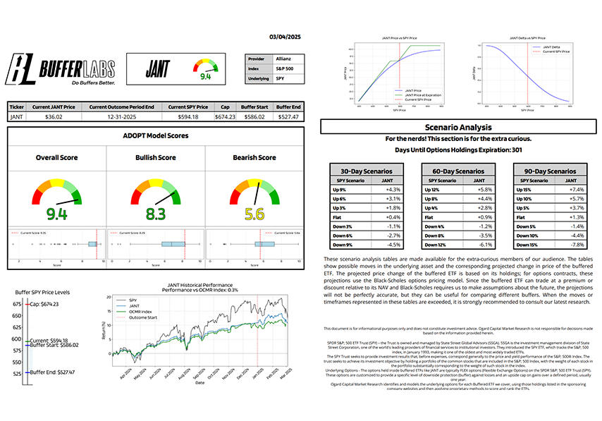
The report header shows ticker, score, provider, tracked index, and underlying asset. The table displays price, outcome period end date, and cap/buffer information quoted in terms of underlying price.
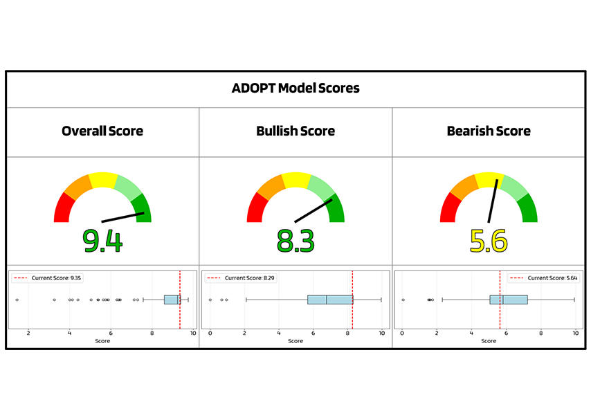
The ADOPT Model uses Black-Scholes components to assess expected price movement relative to underlying assets. It quantifies how much buffered ETFs lag in up markets and decline less in down markets.
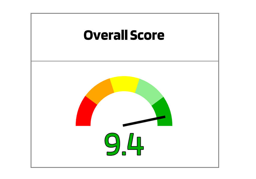
Overall Score reflects risk/reward profile, not risk level. High scores may indicate protective ETFs with limited upside or higher-risk ETFs with reasonable protection. Low scores signal ETFs with more risk than their upside potential warrants.
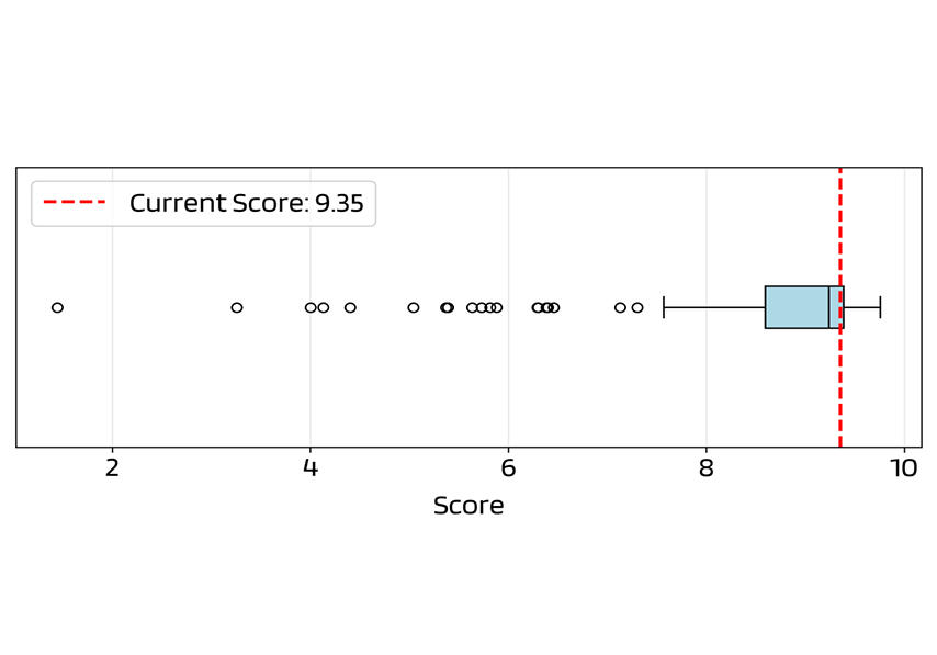
The box plots show score distribution across all ETFs, displaying median, quartiles, and outliers. The box represents middle 50% of data, with "whiskers" extending to values within 1.5× box width from quartiles. The red line shows this ETF's score.
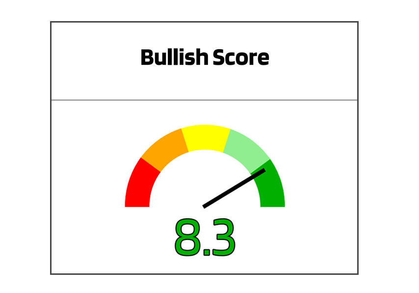
Bullish Score assesses upside participation in near-term market gains. Even top-scoring buffered ETFs lag the underlying in up markets. Higher scores indicate better upside participation for a protection tool.
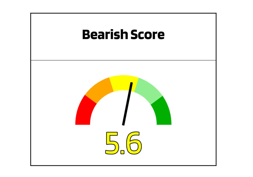
Bearish Score measures downside protection during market declines. Higher scores indicate the ETF is expected to decline less during underlying asset drawdowns.
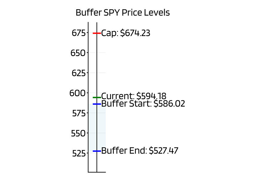
The vertical chart visualizes the ETF's current position relative to its cap and buffer, showing the underlying asset price versus the strike prices of the ETF's options holdings.
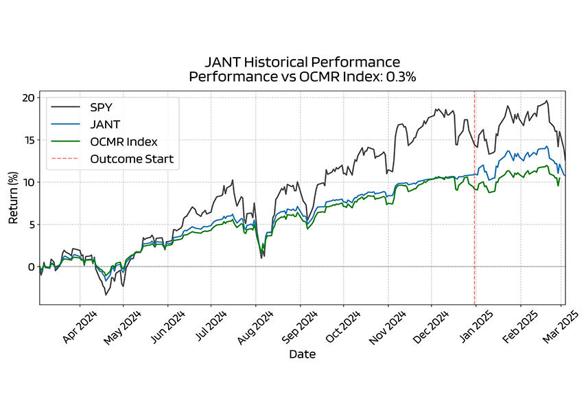
The historical chart compares one-year performance against the underlying asset and our proprietary buffered ETF index, marking outcome period transitions. Our index includes the 100 largest S&P 500-tracking buffered ETFs.
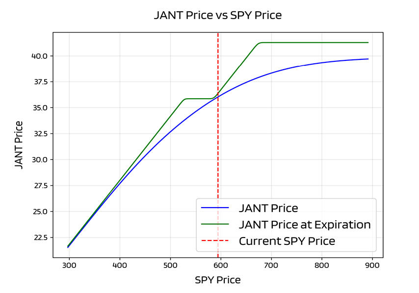
This chart shows expected ETF prices relative to underlying prices at report date (blue) and outcome period end (green). The blue line is time-variant and will match the green line at period end. Best for general price relationship assessment.
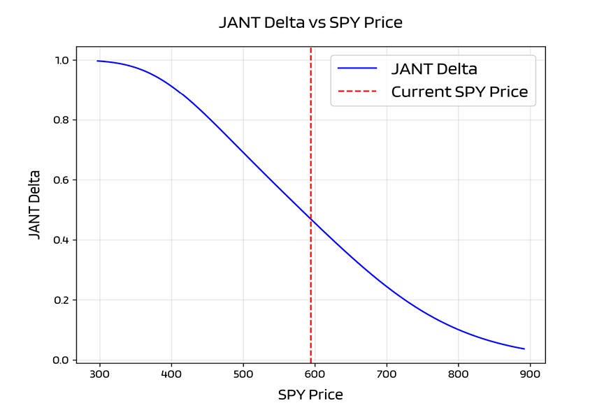
The delta chart shows current total delta of options holdings relative to underlying price. Delta is the partial derivative of ETF price relative to underlying price. This time-variant chart indicates current ETF characteristics.
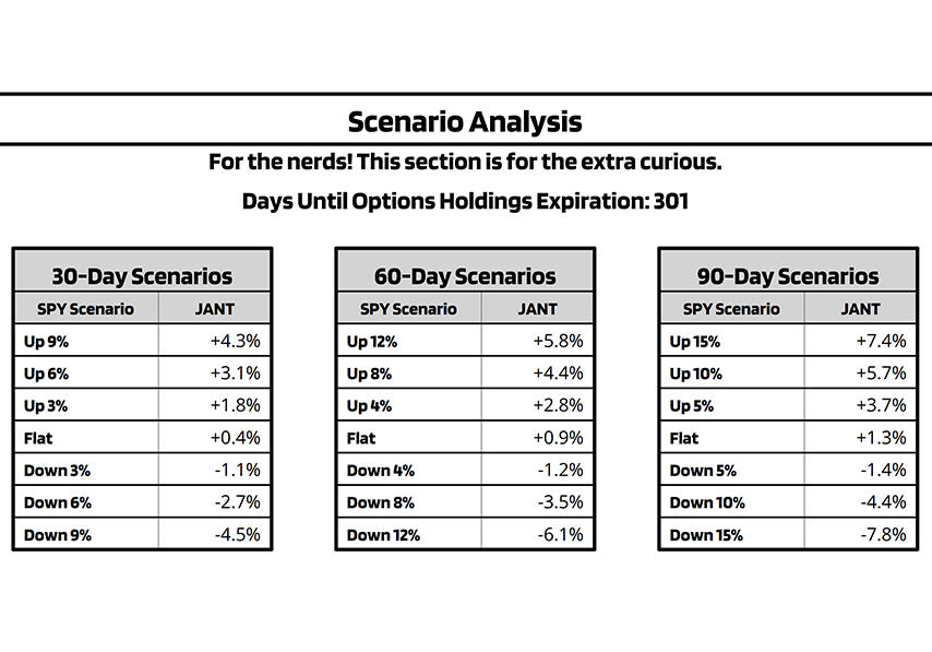
Scenario analysis tables show projected ETF price changes for given underlying asset moves. 90-day scenarios refer to calendar days from report date. For outcome periods shorter than the scenario timeframe, tables show values for the final day of the period.