OCMR Investment Perspectives Volume 1.1
Sometimes taking a very long-term view, describing the core “nature” or “essence” of the market’s behavior, can help put more recent experiences in context. That is precisely the point of this inaugural “Investment Perspectives” piece from Ogard Capital Markets Research, LLC.
Below is a daily logarithmic return chart for the S&P 500 Index starting in 1950 and through Friday, September 5th, 2025.
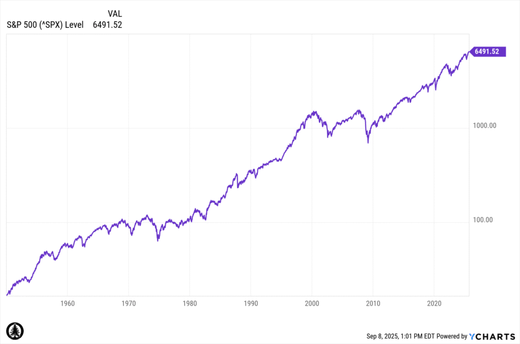
Note: Data sourced from YCharts and used with permission. Not created by Ogard Capital Markets Research LLC.
The approximate long-term nominal (before inflation) average annual return to stocks over this nearly 75-year period represented above is about 10%. Now some capital market forecasters tend to want to make expectational forecasts that deviate from the long-term average represented above to reflect current conditions. Even so, our experience is that the best long-term forecast is the long-term historical experience. Thus, an ongoing long-term return expectation for US stocks of 10% may be reasonable. But what about short term expectations?
It is well known that US stocks have been on a tear since the Covid low of 2020. Putting some long-term context around the shorter-term experience since 2020 may be helpful for understanding how far from “normal” this current experience is. That is the aim of the ensuing pages of this missive.
We are going to examine the long-term return characteristics of the S&P 500 Index beginning in 1950 and compare those characteristics to the more recent experience. We think this exercise will be illuminating or even “eye opening” to many.
Since January 1, 1950, there have been 19,046 trading days. Of those trading days, the market has gone up just under 54% of the time (10,240 up days) by an average of +65 basis points on those days. Conversely, the market has gone down just over 46% of days (8,806 days) by an average of -68 basis points. The market put up average annual 10% returns on this razor thin margin of 1,434 days. This is less than 10% of the total days since 1950 dictating that actual experienced 10% annualized return. The remaining days more or less canceled each other out.
Now, for context, let’s ask our ourselves about the return experience over two distinct short-term periods: since 2020 started and since 2023 started. Since 2020, right before the COVID shut-down and extreme market sell-off, the market dynamics have resembled the longer-term period, but with higher daily volatility. Since 2023, since the Federal government accelerated its spending, we have seen an uptick in percentage winning days but a more normal daily return experience. A big exception is that the winning days during this period are up more than are the losing days. We have not seen this over the longer term. The combined experience of a greater percentage of winning days with a tilt toward bigger gains than losses in winning versus losing days, suggests maybe the market is getting ahead of itself.
| S&P Summary Data | 1950 | 2020 | 2023 |
| Days | 19,046 | 1,428 | 671 |
| Up Days | 10,240 | 771 | 375 |
| % Up Days | 54% | 54% | 56% |
| Average Up Day Return | 0.650% | 0.850% | 0.675% |
| Down Days | 8,806 | 657 | 296 |
| % Down Days | 46% | 46% | 44% |
| Average Down Day Return | -0.681% | -0.890% | -0.668% |
Note: Data Sourced from YCharts and used with permission. Data compiled by Ogard Capital Markets Research, LLC.
Let’s zoom in on the two periods 2020-present and 2023-present to see if we can further illuminate just how good things have been since 2023. Below are two risk/return scatter plots for the two periods in question:
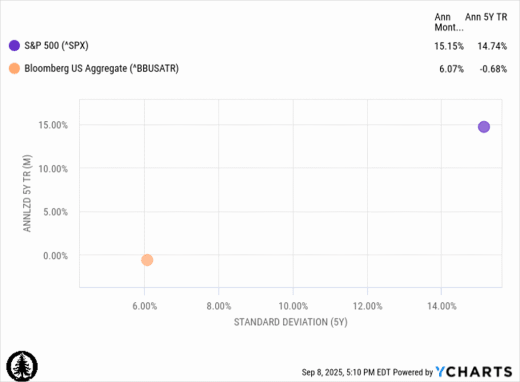
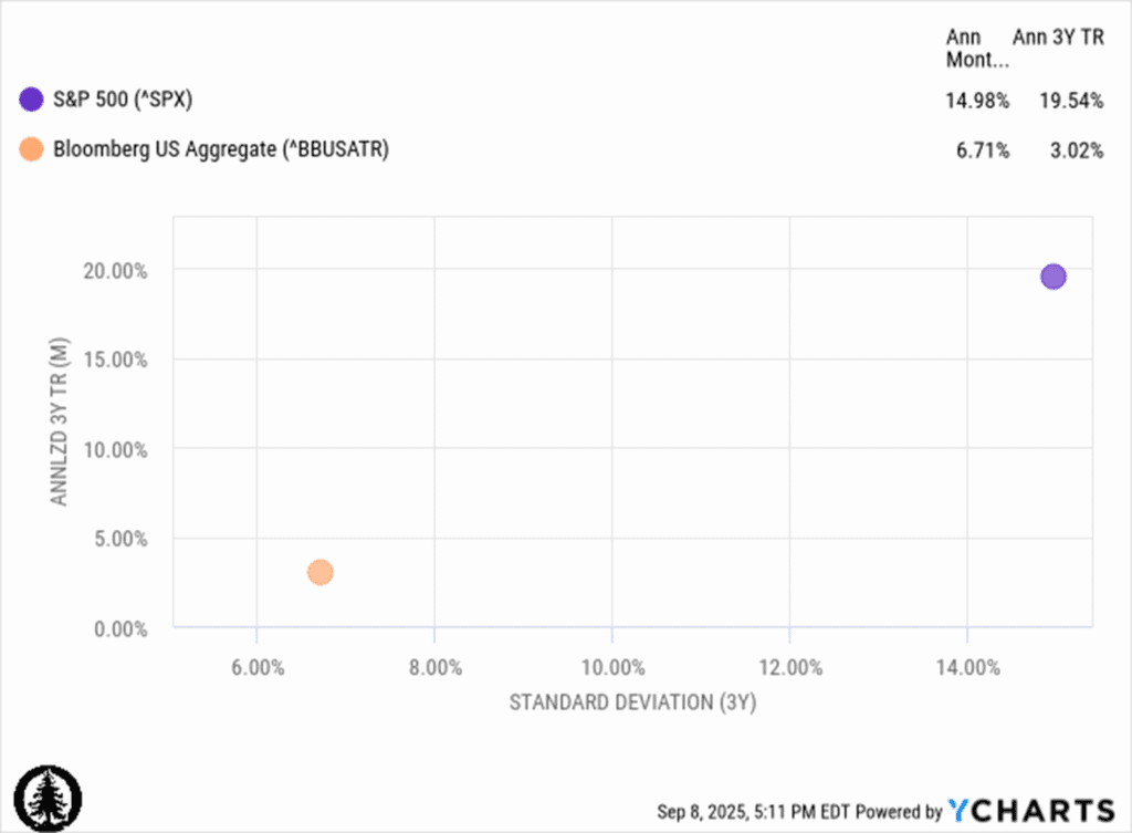
Note: Data sourced from YCharts and used with permission. Not created by Ogard Capital Markets Research LLC.
In comparing the five-year risk/return plots in the top panel above to the three-year risk/return panel on the bottom we can see the returns in both cases are well above the long term expected return of 10%. Over the past three years the annual return has been double the long-term average! This is a lot.
Finally, let’s examine the current valuations of the market relative to the long-term average. Below is the long-term chart of the Shiller CAPE ratio. The CAPE ratio after this three year rally now stands above where it stood prior to the 2022 correction. The only time in the entire history of the CAPE ratio (which goes back to the 1880s) to exceed the current was the period leading up to the “dot com” bubble of 2000. We are about five points away from that high now.
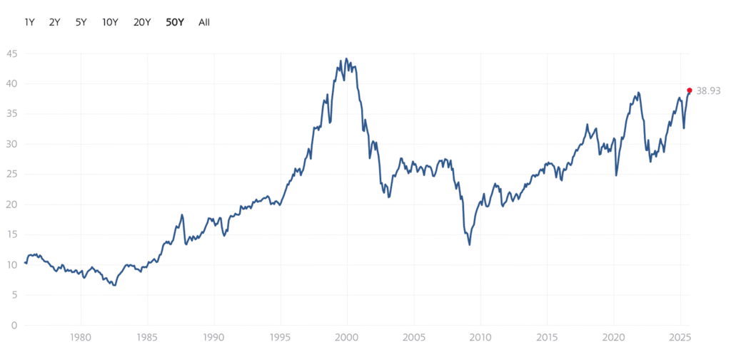
Note: Chart sourced from MULTPL.COM
Is it possible the CAPE ratio could continue higher and eclipse the prior peak? Certainly yes given the hype surrounding the current AI mania. Will it? One can only guess. Our view is that at the very least it may be prudent to either take some equity risk off the table or to hedge equity exposure in the event things mean revert. This advice may be particularly relevant to retirees who cannot afford to take a hit or for risk averse investors who simply can’t stomach volatility. The historical experience is that when returns have been well above the long-term norm while at the same time valuations are stretched, it is a good time to exercise some caution and prepare for volatility and mean reversion.
Disclosure:
The opinions expressed herein are subject to change at any time without notice. This content is for informational purposes only and is not intended to inform individual investment choices, either currently or in the future. It is not meant to provide specific personalized investment, financial planning, tax, or accounting advice. For advice tailored to your situation, you may wish to consult a qualified attorney, tax advisor, or accountant.
Investing involves risk, including the potential loss of principal. Past performance is not a guarantee of future results. The reader should not assume that an investment in the securities identified was or will be profitable. This content is developed from sources believed to be providing accurate information. While reasonable care has been taken to ensure that the information herein is factually correct, OCMR makes no representations or guarantee as to its accuracy or completeness. The content is not intended as financial advice or a solicitation for securities transactions. Forecasts reflect current conditions, may change, and are not assured to occur.
Comments
Excellent analysis and commentary Erik